 Consistency is a crucial part of developing an effective brand, which is why style guides are incredibly useful documents. They give business owners, graphic designers, and anyone else involved with a brand a set of guidelines for how a brand identity should be used, so that they can maintain the integrity of the brand’s design.
In this post, I’m taking a look at what style guides should include in order to help businesses maintain their brand.
What is a style guide?
A style guide (which can also be called a brand guide, brand manual, or other names) is a comprehensive document that outlines the “rules of use” for the key design elements of a brand identity. Style guides standardise how brand elements like logos, colours, typography, images, patterns and more should and shouldn’t be used, and are often beautifully designed documents in their own right.
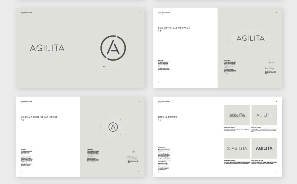
The image below shows some of the pages from a style guide designed by agency, Parent, for workplace furniture designer Agilita. In it, they have outlined how the logo should be placed, along with examples of wrong placement.

The purpose of style guides
A style guide makes it easier for business owners to create new collateral that sits in line with the existing brand. There should be clear and concise guidelines that explain where to place logos, which colour combinations to use, and what the text hierarchy should look like. A style guide also makes it easier for third parties to maintain the integrity of a brand’s design, so outsourcing work can be less of a gamble. Remember, the point is consistency, and consistency is key.
No matter how large or small the business, a style guide can be a great resource to have on file and well worth asking your brand’s designer to create one for you.
Here are a few important brand identity elements that can be covered in a style guide:
Logo
I’m sure every style guide you’ve every looked at has the logo as pretty much the first thing you see. Here is a list of what style guides should include when it comes to logos:
- the minimum size for the logo
- a single colour (black and white) version of the logo
- an inverted colour version
- layout guidelines (e.g. logo clearance area)
- examples of incorrect logo placement
- explanations of when to use
- alternative logos
- a break down of how the logo is created
Brand colours
Giving your brand colours names like “rose” and “slate” not only sounds lovely, but can also be great for establishing your brand’s voice and tone. That’s optional though. What you can never overlook is the brand colour breakdowns. Here’s what style guides should include on colours:
- Hex codes for web development
- RGB colour code for screen
- CMYK colour code for print
- Pantone colour name for print
- Supporting colours
- Descriptions of when to use certain colour combinations
Related post: Understanding colour modes and how to them in design
Brand typography
Naming the various typefaces used in the brand identity (which shouldn’t be more than two or three) is the first thing, but the best style guides don’t stop there. The text hierarchy is also a very essential part of the identity. Here’s what should be included:
- Which typefaces to use for headings, which for subheadings, paragraphs, pull quotes etc.
- Rules for how the type should be treated (e.g. are headings always in lowercase only? Is the business name always capitalised? Font weight? Tracking? Sizing?)
- Any guidelines for how colour should be used with type.
Related post: 5 typographic tips to refer to when designing

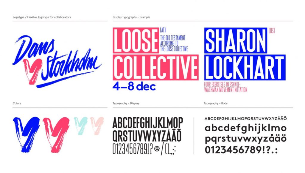
This style guide by creative agency, Snask, for the branding of dance festival, Dans <3 Stockholm, clearly outlines how display typography should be laid out.
Photos & images
For the sake of consistency, style guides should also set a standard of the kind of images a brand will use. A great way to do this is through the use of mood boards or collages that group together a collection of appropriate images in one place. They clearly should the kind of photography that fits with the brand. Style guides should include details about:
- The overall mood for images (created through lighting, saturation, content, etc.)
- Guidelines for photographers or people picking from stock images
- Size and other specifications for banners or blog images on websites or social media
Additional graphic elements
These are any extra supporting elements of the brand identity. The style guide should also include when and how these elements should be used.
- patterns, textures
- iconography
- buttons (links on websites)
Grid systems
To me, this is one of the most vital parts of consistent visual branding. Grid systems indicate where text and images sit on a layout — it’s what ties all the other elements together. The most comprehensive style guides may include grid systems for various layout sizes, such as:
- print paper sizes, like A4, A3, DL
- horizontal web sizes (computers)
- vertical web sizes (tablets and phones)
 Last thoughts
Whenever I create a brand identity for a client, I want to create something that will remain valuable in the long-term. This helps to ensure that their brand identity won’t be diluted over time by inconsistent designs that could have been avoided with stronger guidelines.
The quality of my work is measured (at least in part) by the success of a business’s branding over time. And I’m proud of every bit of design I put out into the world! I want to see it live on good and strong for ages. That’s why building useful, detailed style guides is so vital for clients who plan to take control of their own collateral.
Looking for more content? Try these:
- A complete guide to creating a brand that perfectly suits your business
- Should you hire a graphic designer for your small business?
- When it’s time to rebrand – signs your brand needs reviving
- How defining your core customer will boost your business
- 5 essential elements your visual brand identity needs
- How to use consistent branding to grow your business
- You need to do a brand audit, and here are the great reasons why
- Useful questions to ask when self-critiquing your business’s designs
