 Really good typography can be deceptively hard to achieve. Most people don’t take enough time to consider the balance between different layout elements, text hierarchy and spacing. This leads to a lot of “just typed up in Microsoft Word” looking documents. They might work just fine, but definitely don’t give customers the polished, professional impression you want to aim for.
So here are just 5 typography tips to consider when working with text that will help ensure your website, marketing material, forms and social media pictures all look carefully-considered and easy on the eyes.
Typography tip #1: Limit the number of typefaces
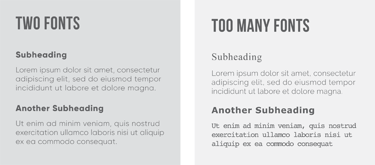
It can be easy to get carried away with the number of typefaces you want to use. (Especially if you’re like me and occasionally go on font sprees and download about 20 new ones at once.) However, using more than a couple different typefaces can often look messy and amateurish.
A good rule to follow is using no more than two. Make sure you’ve got a tidy, highly-readable one for body text, and then a nice, contrasting display font for headings. That doesn’t mean you have to go really fancy! If you’re not confident about choosing fonts, then more minimal sans-serifs give you an option that will be beautiful and timeless.

Typography tip #2: Create a visual hierarchy
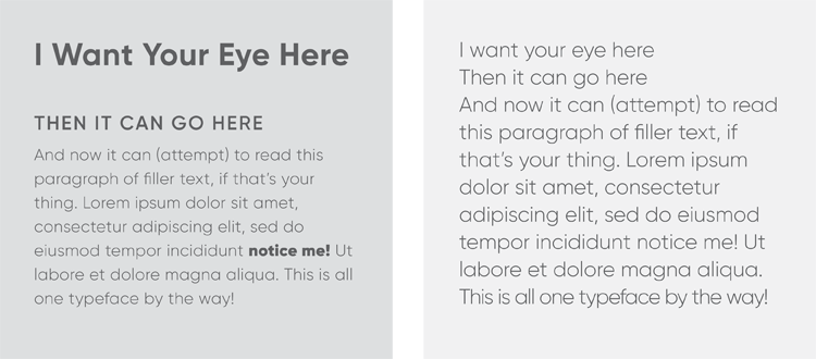
Once you have your font choices, you want to think about things like size, weight and spacing in your typography. Think about how to use these components to make your copy as clear and readable as possible.
Make sure there is a clear contrast between your headings, subheadings and body text. Captions can also require another level in the visual hierarchy. This makes it easy for the reader to follow what they’re reading, and to pick up important information at even just a glance.

Typography tip #3: Watch readability
Readability here refers to how comfortable and easy it is for someone to read words and lines of text. It’s not to be confused with “legibility” which refers to whether it’s possible to make out what is written. Beautiful script typefaces, for example, might be perfectly legible, but reading a lot of it can become pretty tiring for the eye. Same goes for long blocks of text in all-caps.
Visual hierarchy (from the second point in this post) goes a long way to help readability. There are a couple of other things to take into consideration too.
- Font size – Text that is set too big might look clunky and unattractive, but at lease you can see what it says. There’s a problem that I think is all-too-common on many sites these days with teeny tiny text that might pass a test of readability, but not by much. When you’re designing, you have to try your best to design in a way that is accessible for everyone! Including those of us with poor eyesight.
- Colour choices – Make sure there is a good level of contrast between the background colour and the colour of your typography. Like the point above about font size, some people can see contrast between colours less easily than others. Stay on the safe side and keep type clear!
- Leading and tracking – Leading (line height) is the vertical space between lines of text, while tracking (letter spacing) is the spacing between characters. More leading can make long paragraphs easier to read, but don’t add too much tracking in paragraphs. Instead, tracking can be a nice way to style headings and other short lines of text. Decreasing tracking can be a solution to avoiding widows and orphans (more on than in the next point), but make sure the letters don’t start running into each other.
Typography tip #4: Use grids to align your text
Good layout design often starts with a grid. You can think of a grid as invisible lines tying the various elements on a page together. It helps to create consistency and provides a solid foundation for building your visual hierarchy.
If you’re no professional graphic designer, don’t feel the need to get too caught up in grid theory! Just know that having your typography line up nicely looks more pleasing to the eye.
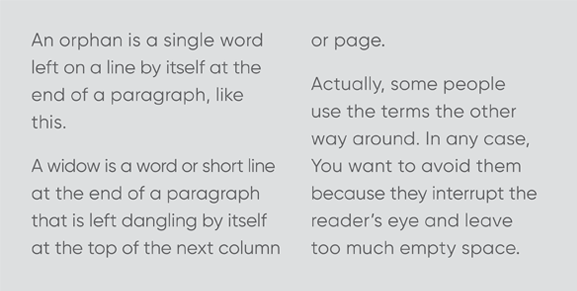
Something else to look out for when dealing with paragraphs are widows and orphans. Widows are single words trailing at the bottom of a paragraph. Orphans are a single word trailing at the top of the next column or page. They tend to break up a nice layout design by leaving so much empty space. Where possible, try re-wording sentences or use tracking to avoid leaving widows and orphans.
That being said, in today’s world of responsive web design and different screen sizes, it’s impossible to avoid them altogether. Don’t go too crazy trying to stop them from happening on your website.

Typography tip #5: Check your spelling and grammar
Lastly, although I’ve given you lots of think about when it comes to laying out your text, this point is still probably the most important. Nothing screams “unprofessional” like typos, bad sentence structure and incorrect punctuation. And there’s also nothing worse than finding a mistake after you’ve sent something to print or uploaded it onto your social media page. So before that can happen, be sure to read through every line of text, and run spell-check to help catch anything you might have missed!
 Last thoughts
I hope these typography tips help you when it comes to designing the look of your website, blog posts, forms, newsletters or anything else! Remember to stick to your brand identity as well. Use consistency in the typefaces you use, and the colours you choose. Good luck with your designs!).
Do you have any other typography tips that I didn’t mention?

Hi Lisa!
These tips were great, it was also helpful that you gave a visual example of each to make it easy to understand for a beginner. Very easy to remember and definitely fruitful.
Thanks.
Wow! This is a very helpful article with amazing tips for business.
Wow! Such a very useful article because Typography is important for any business, and with the right tips, you can improve the look and feel of your website. I appreciate to sharing with us.
Great article! I love how public inquiries and comments can lead us to investigate our own collections more closely. Great job finding such a trove of treasures.
What classic posts, All tips are very informative and beneficial for all businessmen. I really impressed by your article.
Thanks for finally sharing this article.
This is a really helpful tip. Thank you for your support.