

"Fill your schedule with ease."
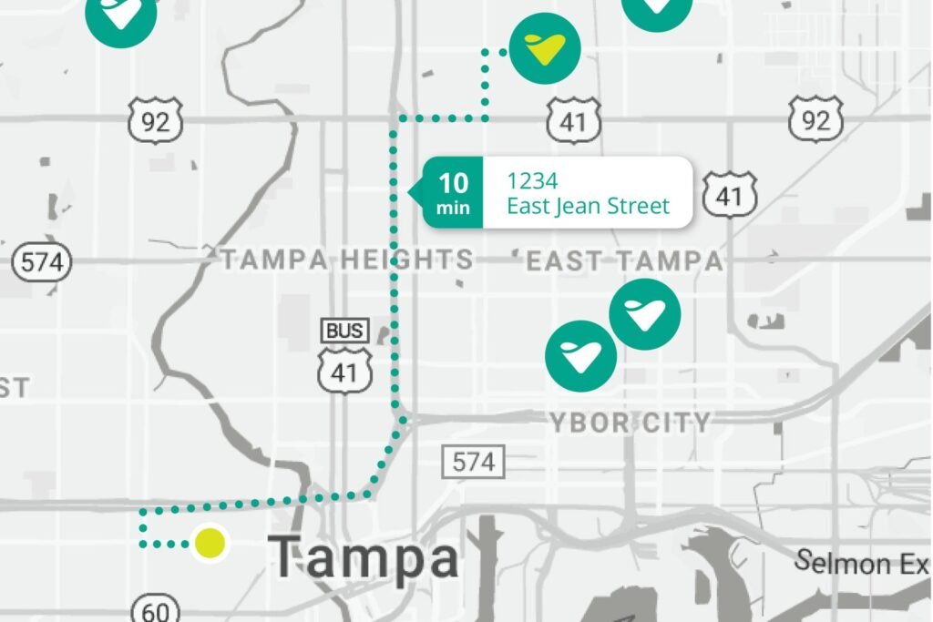
Visitry is a new app that connects home health clinicians directly with patients in their area, giving clinicians convenience and peace of mind of knowing they can fill their schedule.
As he prepared to launch the app, founder Brock Lister wanted branding that would convey the right tone — one of calmness and neatness, that was often missing in his target audience's lives.
Brand strategy
Logo & identity design
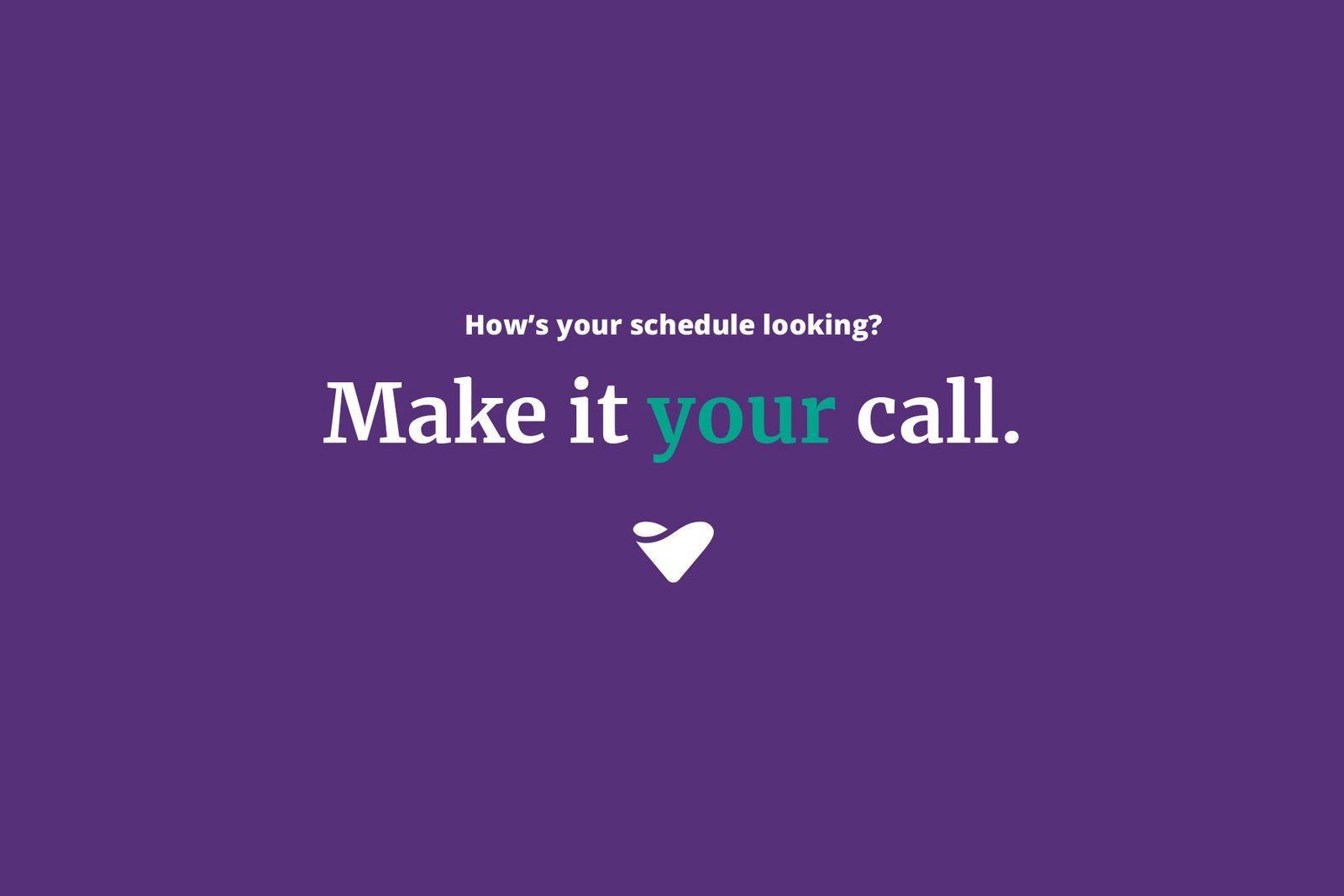
Tagline & messaging
For any business, the logo is an important visual marker to encapsulate the brand in a single symbol. For an app like Visitry, this is even more the case, as the logo becomes the icon that users see on their device, when looking to use the app.
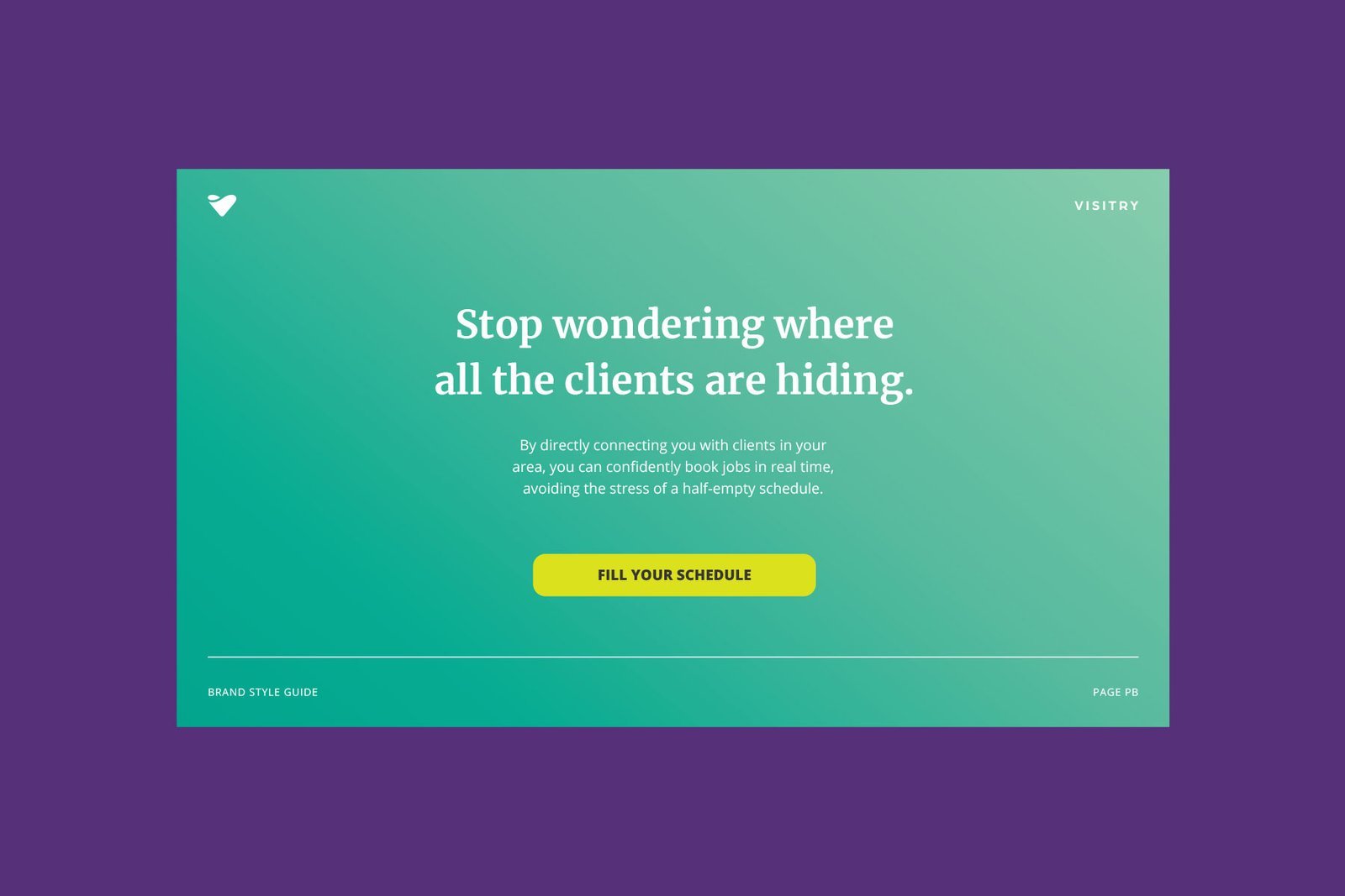
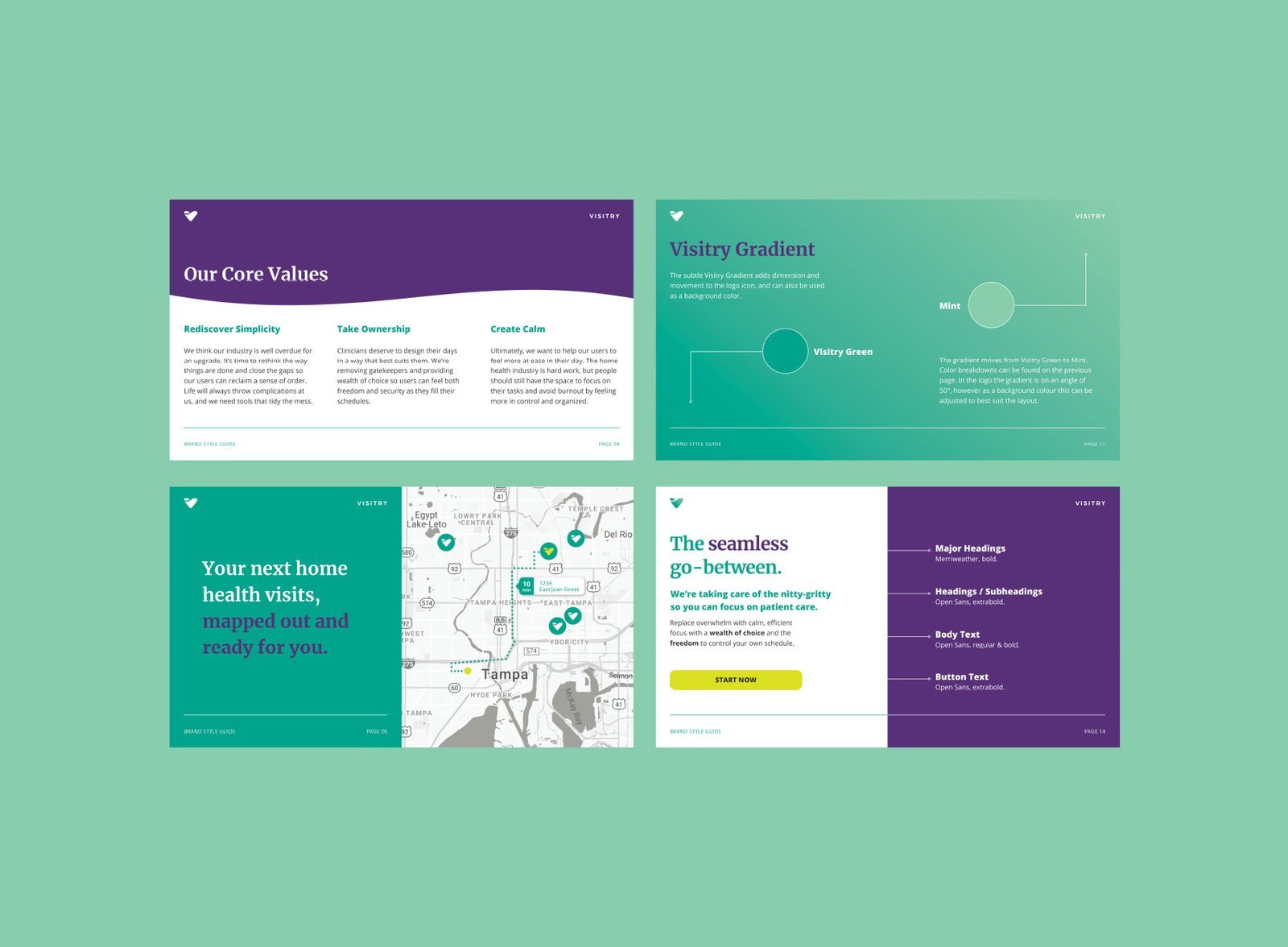
We wanted the logo to reference the name (creating a "V" shape for Visitry), as well as subtly linking to important attributes of the brand. A sense of flow and ease. A shape that might be a caring heart, or a full cup — highlighting the idea of abundance.
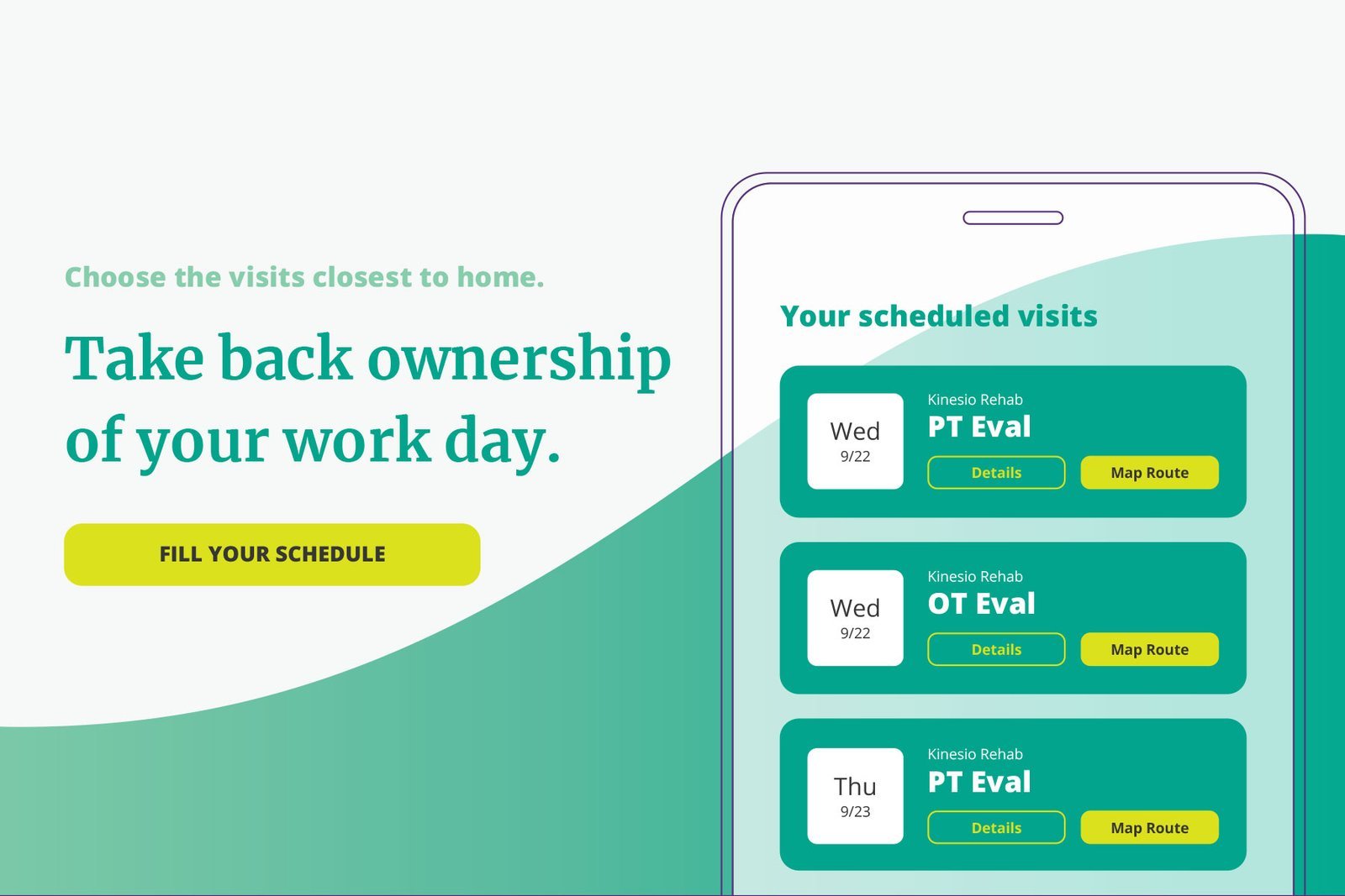
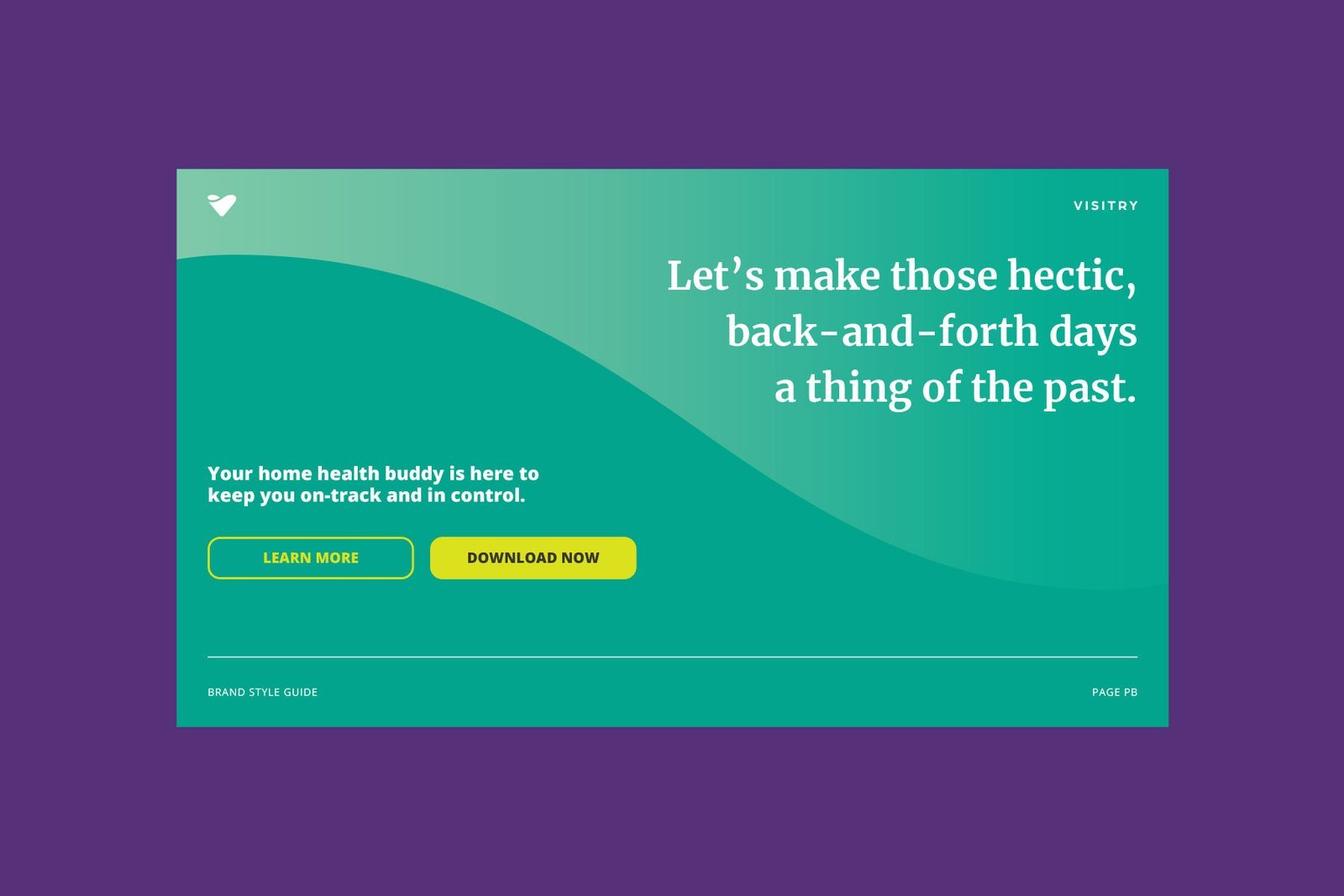
The new branding makes use of calming greens, sometimes appearing in a soft gradient that brings a glow and movement to layouts.
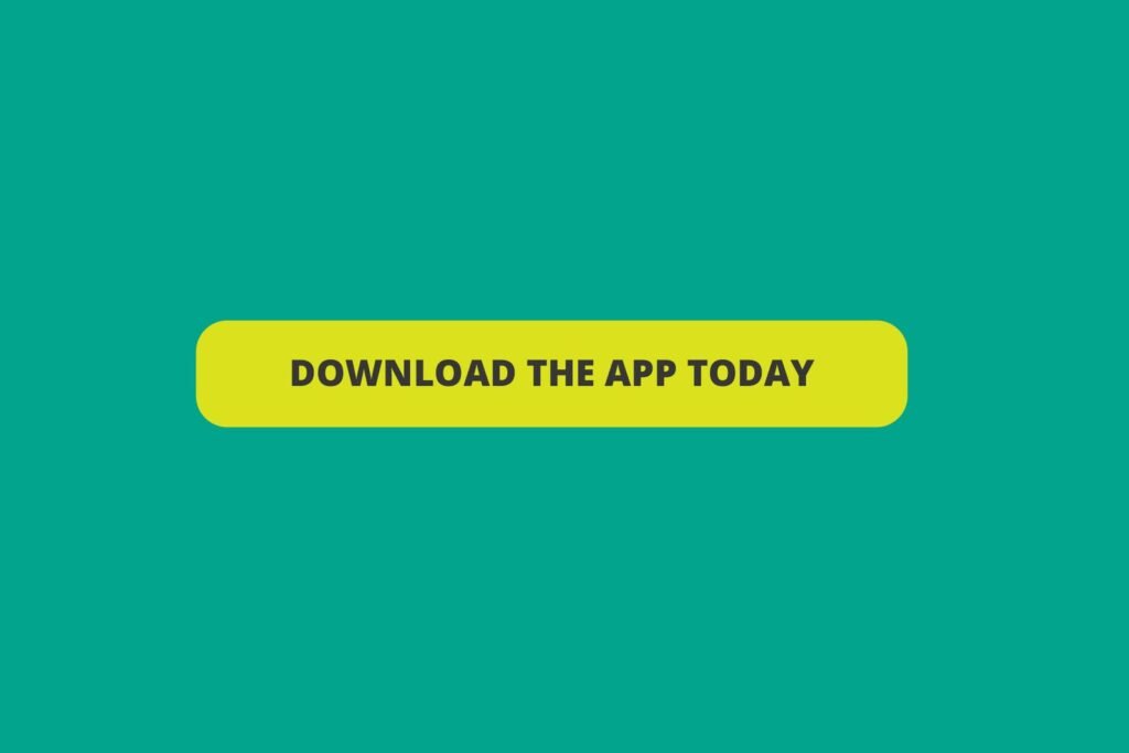
To complement the green, we introduced a deep purple and, as a finishing touch, a vibrant lime accent colour that is used to communicate interactive elements of the app (such as buttons and clickable icons) to the user.
“I am ecstatic about our new look and I’ve just been thinking about how to plaster it everywhere!”
Brock Lister, Founder & CEO, Visitry
The final outcome is a brand style that has a strong recognisability when in use, with colours, lines and shapes that work seamlessly together to express the brand's calming and convenient modern role in the home health industry.
“Lisa has a thorough process that I believe will result in the most accurate expression of your personal or company vision.”
Brock Lister, Founder & CEO, Visitry

Project by
Lisa Furze, Brand Designer