"Executive leadership development for the forward-focused"
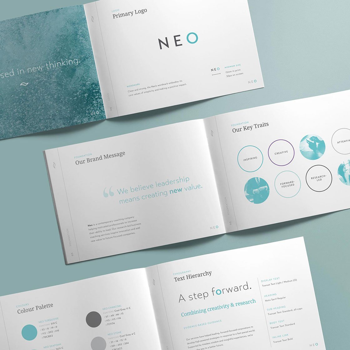
Executive leadership development company, NEO, was looking to realign its branding to match its current values and direction, which had changed since the design of its previous identity in 2011. NEO puts its focus on innovative leadership and the development of effective collaboration, as well as the overarching importance of corporate social responsibility — points that needed to be communicated in NEO's new visual identity.
Brand strategy
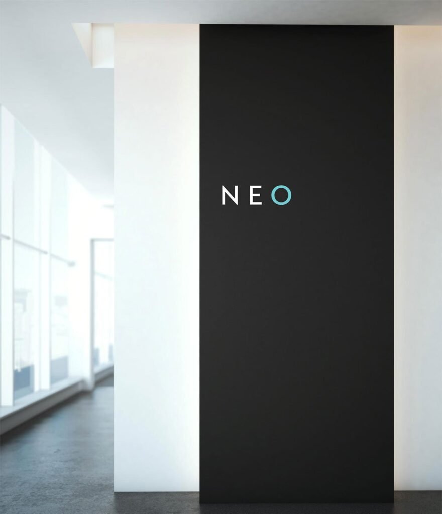
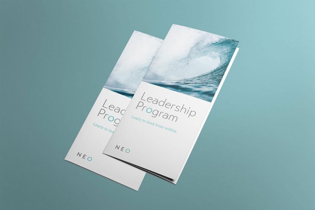
Logo & identity design
Tagline & messaging
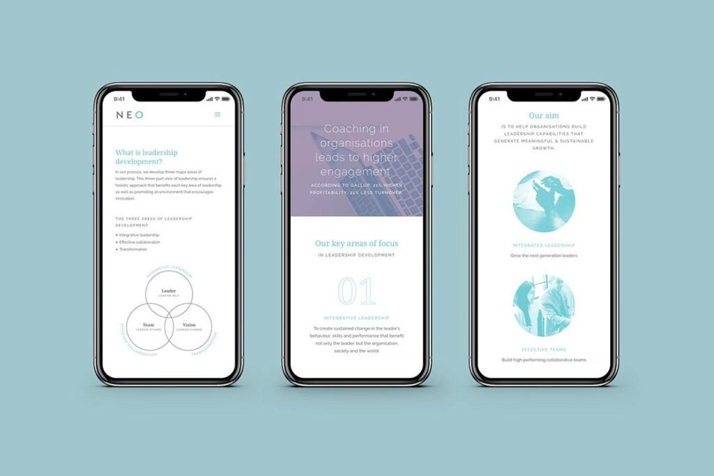
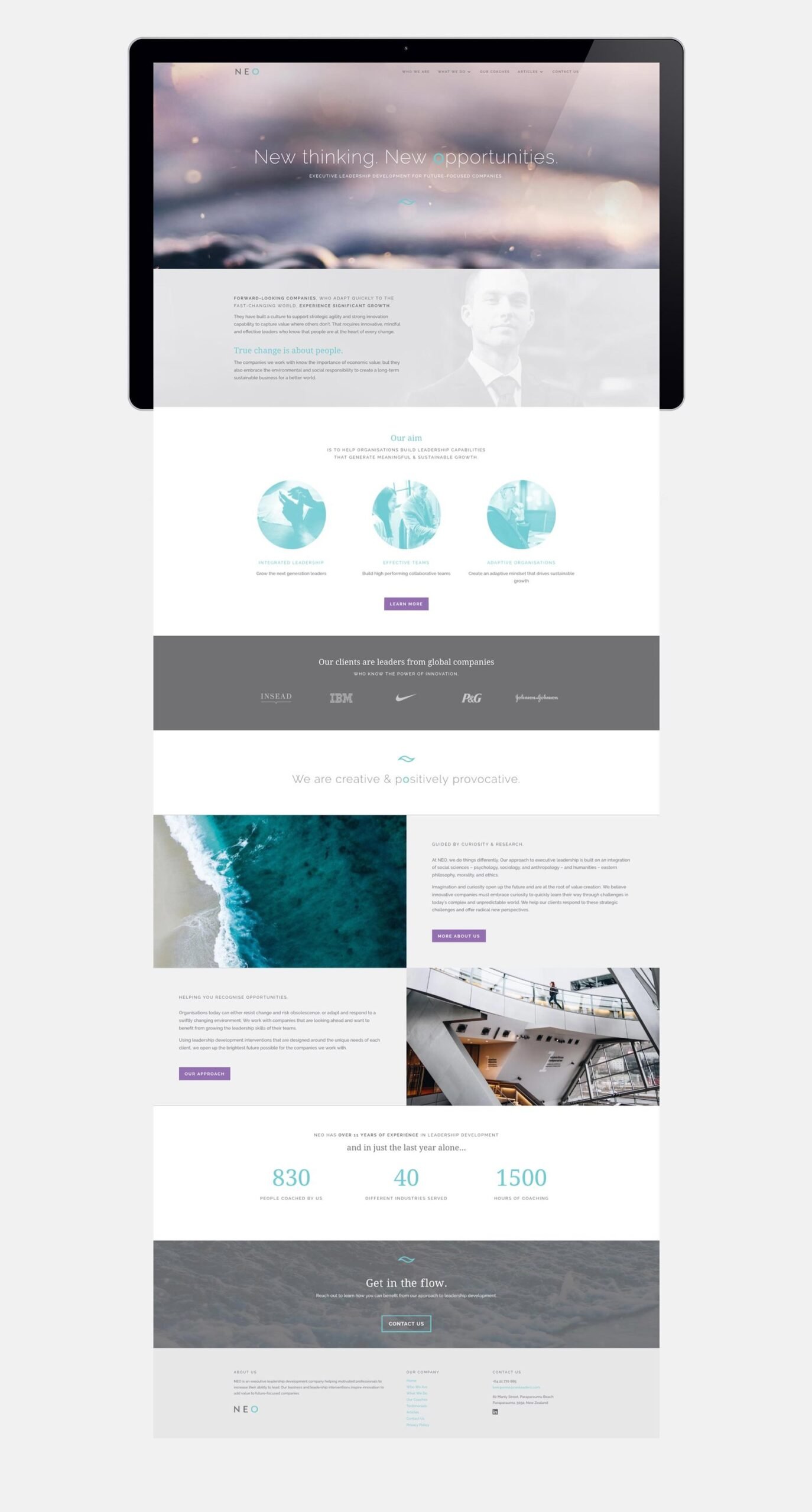
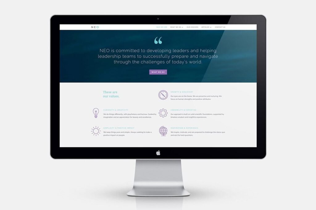
Website
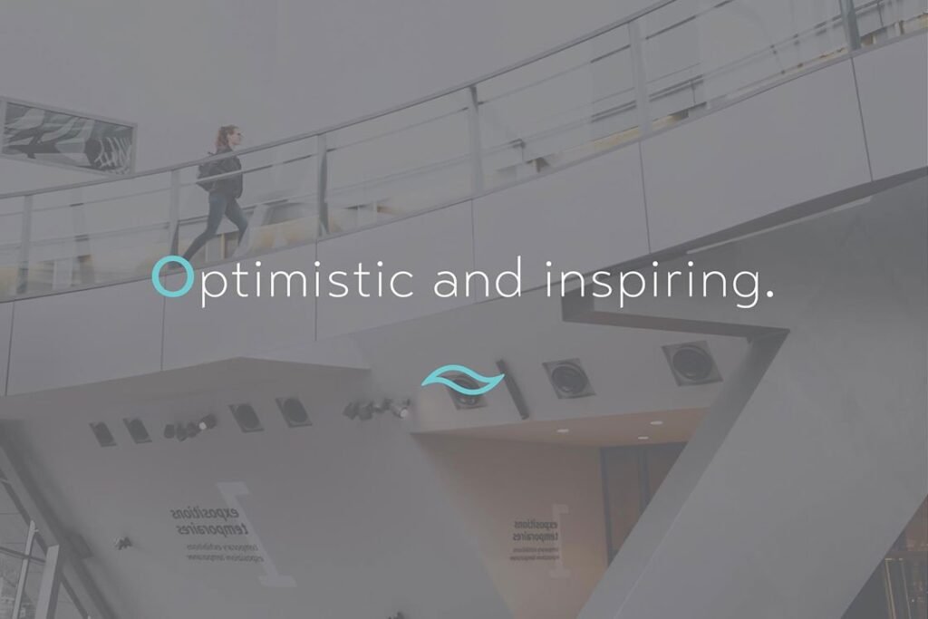
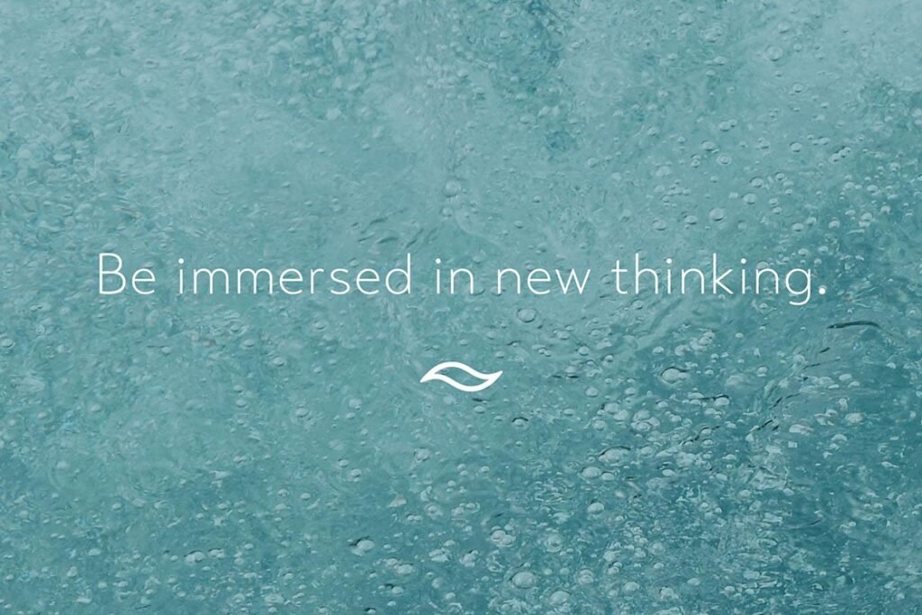
The theme of water used in NEO's brand identity has multiple meanings that are relevant to the company. Firstly, it links to environmental awareness that NEO highlights as a key ethical responsibility of leaders today.
It also reflects NEO beliefs in leadership which are partly inspired by Eastern philosophies, in which water is a common metaphor for positive change. Water is fluid, responsive and flexible — attributes necessary for innovation and growth. This helps to communicates NEO's mission to develop leaders that are prepared to adapt and face the challenges of today's world.
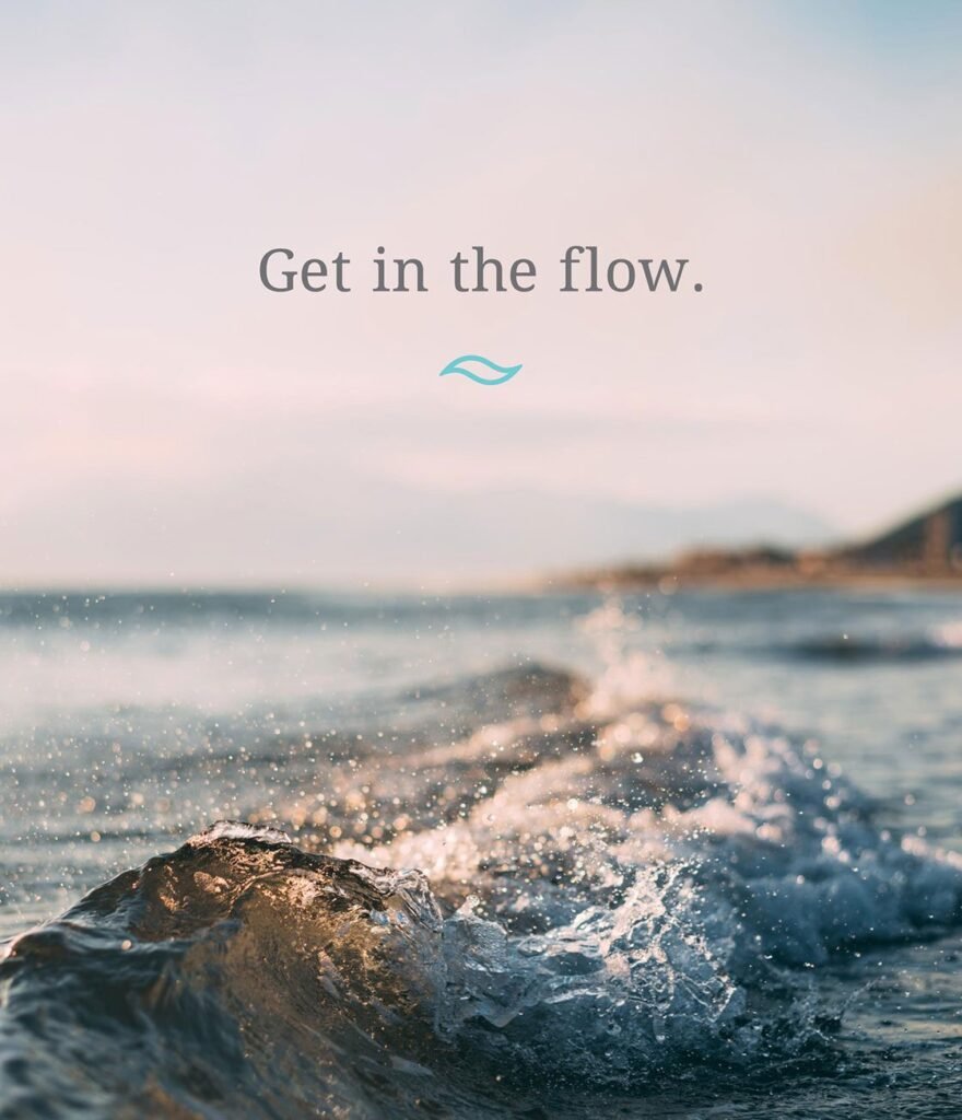
“Water flowing downhill adapts to the turns and twists it encounters, often taking odd paths or being momentarily interrupted, but always proceeding. Faced with an obstacle, water simply finds a solution, without force or conflict.”
Adapted from Taoist philosophy
“NEO helps organisations to create new value through innovative leadership.
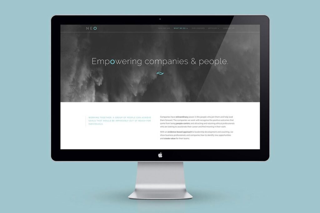
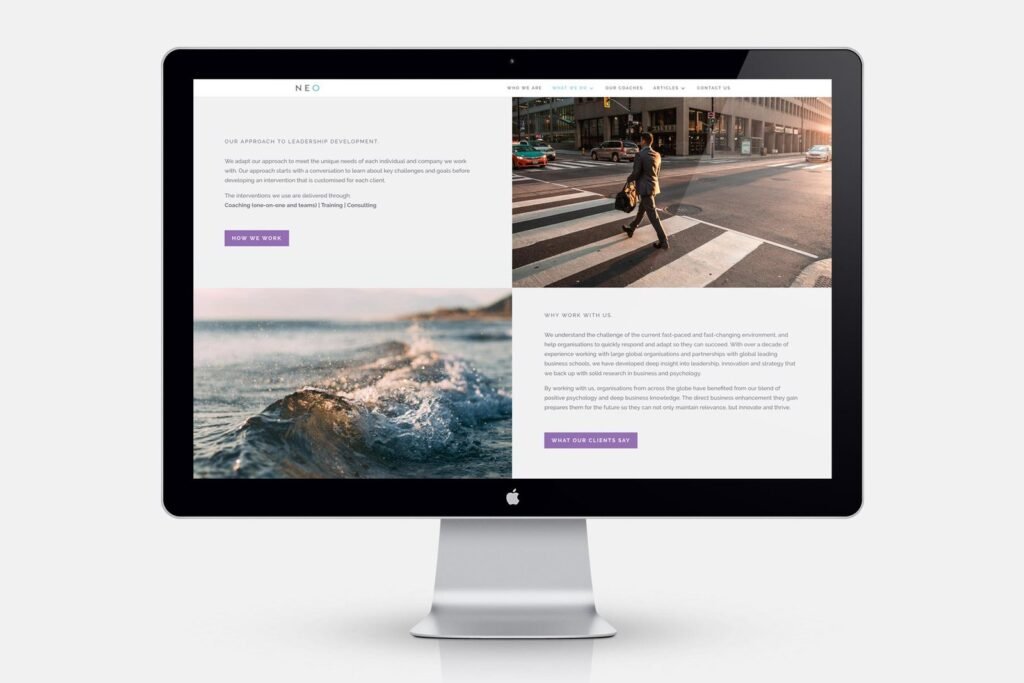
The target market was identified as being world-wise and motivated, but also time-poor. As such, keeping the user experience streamlined and simple was a key consideration in the new branding. Everything from the logo to the website was pared back to their most minimal forms, whilst maintaining distinct design elements that tie the brand together and create a recognisable image.
“A great benefit was Lisa’s ability to translate the requirements into a design that fits the brand perfectly.”
Ben Ponne, Managing Director, NEO

Project by
Lisa Furze, Brand Designer